Preface by Simon M. Mudd
Welcome to Numeracy, Modelling and Data Management for the Natural Sciences. Research in the Natural Sciences has evolved rapidly in concert with the rapid evolution of technology. While the content of many natural science disciplines has certain fixed reference points (e.g., Darwinian evolution in Biology, Plate Tectonics in the Earth Sciences), the methods by which today’s research students conduct research is quite different from a generation ago.
This book has emerged from a course that I teach as part of a doctoral training program at the University of Edinburgh. Students in our program have backgrounds in geology, geography, ecology, biology, and other allied fields. Their disciplinary knowledge is quite disparate. Regardless of discipline, however, research students need some shared tools to do research. This course is designed to provide some basic tools that serve as a starting point for students to learn about numeracy, modelling and data management.
1. Background and Motivation
This course is designed for students who hope to engage in scientific research.
What do we mean by "scientific"? If you look up "science" in a dictionary you will probably find something similar to what is on the Wikipedia page for science:
Science (from Latin scientia, meaning "knowledge") is a systematic enterprise that builds and organizes knowledge in the form of testable explanations and predictions about nature and the universe.
Two important words in that definition are "systematic" and "testable". The most common form of scientific communication today is the publication of scientific work in peer-reviewed journals. The process of getting your work published in such a journal involves convincing reviewers, who are other scientists, that you have been systematic in your research and you have "tested" what you claim to have tested (for example, that your data show what you say they show).
Now, not every person who does research will end up working as a scientist, but I would argue skills gained in being systematic about gathering knowledge, and being able to convince people that you have performed legitimate tests on gathered information is useful beyond the scientific publishing.
1.1. Reproducible research
One way in which you can convince others that you have done what you say you have done is to ensure your research is reproducible. Another person should be able to read your paper and reproduce your results. In 1989 Stanley Pons and Martin Fleischmann claimed to have carried out a successful cold fusion experiment, but others were unable to reproduce their results and thus their findings were considered unsound.
Naturally you want to avoid this sort of thing. Ideally all research should be reproducible. But researchers actually have quite a poor track record for creating reproducible research. Ask a senior academic staff member to reproduce the results from their PhD or even show the documentation of the data, figure preparation, etc. Many will be unable to do so.
In this course we are going to introduce you to various tools that will enable you to do research, but we would like you to learn these in the context of research reproducibility. We would hope that 20 years from now you will be able to reproduce the work that lead to any dissertation, thesis or paper. In this regard, we are holding you to a higher standard than current academic staff! But I believe it is better to be ahead of the curve on research reproducibility than behind it. Many major journals are shifting to require more documentation of research methods to ensure reproducibility of published work.
1.1.1. Further reading
Before you begin looking at the research tool in the course, you should read the following articles:
-
Open code for open science (published in Nature).
-
Code share (published in Nature Geoscience).
You might also find the following material interesting:
1.2. Open source tools for research
On a more practical topic, there are many open source tools that are extremely useful for aspiring researchers. A number of these will be covered in the course. We will focus on tools that are open source. This is for the basic reason that if you do research within a proprietary framework you erect barriers to research reproducibility.
In addition, you might not have funding available for the proprietary tools that are available at one institution if you move on to another. It is somewhat safer to use tools that you know you can download onto any computer legally.
The tools we will be using are:
-
A text editor. There are many options but we like Brackets.
-
Version control using git and hosting sites github and bitbucket.
-
Open source figure preparation and drawing tool Inkscape.
-
Open source Geographic Information System QGIS.
You will need to install some software on your computer before you can proceed with this course. I am afraid this will take some time. Use the quick links below to get everything installed before moving on to the next chapter. If you want more detail you should head to the Appendix: Software.
1.3. Summary
Hopefully I have convinced you that using tools such as version control and scripting for your everyday research tasks is a valuable use of your time. Next, we want to get you started using some of the tools that have been highlighted in this chapter.
2. Simple commands in the shell
Within unix/linux, we often work within something called the shell. It is a text based system that allows you to run programs and navigate and modify files.
If you are used to windows-based systems, it may seem archaic to use a text based system, but scientists, engineers and programmers have been using these systems for years and have designed them to be fast and efficient, once you learn how to use them.
Here we will introduce you to some basic shell commands you will use frequently.
2.1. External resources
You can start by watching the videos listed below (in the Videos section), but if you want more information there are numerous websites that list common shell commands:
-
http://www.tutorialspoint.com/unix/unix-useful-commands.htm *`http://freeengineer.org/learnUNIXin10minutes.html
If you want a gentle introduction to the shell, Software Carpentry is an excellent resource.
Software carpentry’s tutorials on the shell are here: http://software-carpentry.org/v5/novice/shell/index.html
2.2. Commands that will save you vast amounts of time
| Shortcut | What it does |
|---|---|
cd /directory1 |
change directory to /directory1. See notes here. |
cd .. |
Go up a directory level |
ls |
Lists all the files within a directory |
ls -l |
Lists all the files with details |
ls *pattern |
Lists all files ending with |
ls pattern* |
Lists all files starting with |
ls *pattern* |
Lists all files with |
mv file1 file2 |
Moves a file. The files can have a directory path |
cp file1 file2 |
Copies file1 to file2. Can include a directory path |
mkdir directoryname |
Makes a directory with the name directoryname |
rm file1 |
Removes the file with filename file1. The pattern rules using |
rmdir directoryname |
Removes the directory directoryname. It has to be empty. If you want to remove a directory that contains files you need to use |
| Shortcut | What it does |
|---|---|
tab |
Autocompletes file and directory names. |
ctrl-e |
Moves cursor to end of command line |
ctrl-a |
Moves cursor to beginning of command line |
Up and down arrows |
Scrolls through history of commands |
2.3. Videos
Here are some videos that take you through simple commands in the shell
-
The most basic shell commands: http://www.geos.ed.ac.uk/~smudd/export_data/EMDM_videos/DTP_NMDMcourse_video_004_simpleshell.mp4
-
Linking to your datastore drive: http://www.geos.ed.ac.uk/~smudd/export_data/EMDM_videos/DTP_NMDMcourse_video_005_linktodatastore.mp4
-
Making files and directories http://www.geos.ed.ac.uk/~smudd/export_data/EMDM_videos/DTP_NMDMcourse_video_006_mkfilesdirs.mp4.
-
Moving and copying files: http://www.geos.ed.ac.uk/~smudd/export_data/EMDM_videos/DTP_NMDMcourse_video_007_mvcpfiles.mp4.
3. Version control with git
In this section we’ll take you through some software call git. It is version control software. This lesson will rely heavily on the lessons at Software Carpentry.
3.1. What is version control
Very briefly, version control software allows you to keep track of revisions so that you can very easily see what changes you have made to your notes, data, scripts, programs, papers, etc. It is also very useful for collaboration. Once you start using version control, the thought of having any data, papers, scripts or code not under version control will fill you with a sense of dread and will keep you awake at night. Because without it is it very easy to lose track of your modifications, updates, and versions that resulted in figures from papers, reports, etc. I firmly believe every scientist should use it.
In this course we are going to use it to keep track of your progress, and in doing so we hope that techniques for producing reproducible research (see section :ref:`background-head`) become second nature to you.
If you want a more detailed explanation of version control, written in plain English, see the outstanding lesson available at software carpentry: http://software-carpentry.org/v5/novice/git/00-intro.html.
3.1.1. Getting git started
If you have installed git on Linux or MacOS, you will be able to use it in a terminal window. If you are on Windows, after you have installed git for windows you should use Windows Explorer to find a folder in which you want to keep files, and then right click on that directory to select git bash here. That will open a powershell window, with git enabled, located in that particular directory.
3.1.2. git basics
The videos introduce you to the most basic operations in git, and if you want more written detail you can look at the git documentation on Software Carpentry.
We are going to start by making a markdown document. Markdown is a kind of shorthand for writing html pages. You don’t really need to worry too much about markdown at this point, since we’ll go through the basics in the videos. However, if you yearn to learn more, here are some websites with the basics:
You will want to use a text editor to write this file (NOT WORD OR WORDPAD!!); we recommend Brackets because it is both a nice text editor and because it works on Windows, Linux and MacOS.
3.1.3. Videos
-
Git basics: http://www.geos.ed.ac.uk/~smudd/export_data/EMDM_videos/DTP_NMDMcourse_video_012_gitbasic.mp4.
-
Looking at changes using git: http://www.geos.ed.ac.uk/~smudd/export_data/EMDM_videos/DTP_NMDMcourse_video_013_gitlog.mp4.
-
Creating a repository on github <http://www.geos.ed.ac.uk/~smudd/export_data/EMDM_videos/DTP_NMDMcourse_video_014_github.mp4.
3.2. Getting started with Git
We will assume you have installed git. If you are working on the University of Edinburgh’s GeoScience servers, it is already installed. You can call it with:
$ gitThe interface is the same in MacOS. In Windows, you should install git for windows. Once this is installed, you can right click on any folder and select Git bash here. That will open a powershell window in that folder with git activated.
Much of what I will describe below is also described in the Git book.
The first thing you want to do is set the username and email for the session. If you are using github or bitbucket to keep a repository (more on that later) it is probably a good idea to use your username and email from those sites:
$ git config --global user.name "John Doe"
$ git config --global user.email johndoe@example.com
If you prefer to only set the user name for the current project, you can use the --local flag:
$ git config --local user.name "John Doe"
$ git config --local user.email johndoe@example.com
You can check all your options with:
$ git config --list3.2.1. Setting up a git repository
First, I’ll navigate to the directory that holds my prospective git repository:
$ pwd
/home/smudd/SMMDataStore/Courses/Numeracy_modelling_DM/markdown_test
Now I’ll initiate git here:
$ git init
Initialized empty Git repository in /home/smudd/SMMDataStore/Courses/Numeracy_modelling_DM/markdown_test.git/
3.2.2. Adding files and directories to the repository
So now you have run git init in some folder to initiate a repository.
You will now want to add files with the add command:
$ git add README.mdYou can also add folders and all their containing files this way.
3.2.3. Committing to the repository
Adding files DOES NOT mean that you are now keeping track of changes. You do this by "committing" them.
A commit command tells git that you want to store changes.
You need to add a message with the -m flag. Like this:
$ commit -m "Initial project version" .Where the . indicates you want everything in the current directory including subfolders.
You could also commit an individual file with:
$ commit -m "Initial project version" README.md3.3. Pushing your repository to Github
Github is a website that hosts git repositories. It is a popular place to put open source code.
To host a repository on Github, you will need to set up the repository before synching your local repository with the github repository.
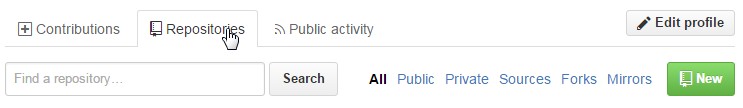
After you sign up to Github, go to your profile page, and click on the repositories tab near the top of the page, and then click on the New button to the right:
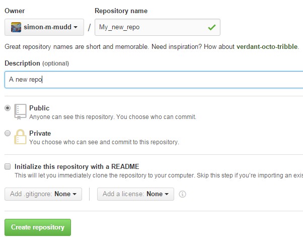
Once you do this, add a sensible name and a description. I would strongly recommend NOT initializing with a readme, but rather making your own readme.
Once you have done this Github will helpfully tell you exactly what to do:
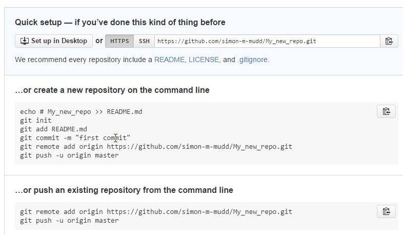
If you have been following along, you will already have a git repository, so all you need to do is add a remote
and then push to this remote:
$ git remote add origin https://github.com/your-user-name/your-repo-name.git
$ git push -u origin master
Counting objects: 36, done.
Delta compression using up to 64 threads.
Compressing objects: 100% (33/33), done.
Writing objects: 100% (36/36), 46.31 KiB, done.
Total 36 (delta 8), reused 0 (delta 0)
To https://github.com/simon-m-mudd/markdown_test.git
* [new branch]      master -> master
Branch master set up to track remote branch master from origin.
3.4. Problems with Setting up repos on github
Occasionally git will misbehave. Here are some examples and their solutions.
3.4.1. Problems arising when you edit files on Github rather than in your local repository
This problem occurs when you edit files on the GitHub website. I would advise against this, and is why we advise not to create a readme.md via Github. I made a local github repository using:
$ git initAnd then tried to push to a github repo, but the first error message is you need to make a repository on github first. I added a readme file on Github, but this seemed to lead to errors:
Updates were rejected because the tip of your current branch is behind
hint: its remote counterpart. Merge the remote changes (e.g. 'git pull')
To fix this you can touch your repository:
-
On the local repo, I used:
$ touch README.md $ git add README.md $git commit -m "Trying to add readme" . -
Then I pulled from the master:
$ git pull origin master -
Then I pushed to the master. That seemed to fix things:
$ git push -u origin master
3.5. More advanced version control
In this section we will explain the basics of working with a repository on more than one computer. The basic case is that you want to work on something from your work computer and from your home computer. The lesson assumes you have already set up a GitHub repository. If you haven’t, start here: <Getting started with Git>.
This section complements the always outstanding instructions at Software carpentry.
3.5.1. Giving other people commit privileges to your repository
On GitHub, anyone can grab your files and download them onto their computer.
Not everyone, however, can make changes to your repositories.
But what if you want to collaborate on a repository?
You can, by changing the commit privileges on your repository.
Gihub proves instruction on how to add collaborators to your GitHub repository: https://help.github.com/articles/adding-collaborators-to-a-personal-repository/
3.5.2. Pulling, fetching, merging and cloning
If you have made a repository, you should already be familiar with the git push command.
This command tells git to "push" all your commits to a remote repository
(which is usually GitHub or Bitbucket.
But what if you have an up to date repository on GitHub and you want to start working on this repository on your home computer?
For this, you will need to learn about the git commands pull, fetch, merge and clone.
We will discuss these commands below, but you can also read about them on GitHub help and at the Software Carpentry collaboration lesson.
Cloning a repository
If you want to reproduce a repository on your home computer, the place to start is probably by using the clone command.
This command copies all the files in a repository to your computer, and begins tracking them in git. You do this by typing in:
$ git clone https://github.com/USERNAME/REPOSITORY.gitWhere you need to update the USERNAME and REPOSITORY to the appropriate names.
If it is your repository
If the repository belongs to you, you can start committing changes on the new computer and then pushing them to master:
$ git push -u origin masterThe origin is the name of the remote directory.
If you use the clone command on your own repository the origin of the cloned repository will automatically be your github repository.
It is essential that if you clone a repository so that it is on two different computers, you use the pull command (see below) before you start working.
Otherwise, you will put one of your repositories out of synch with the "master" repository and you will need to use the "merge" command, which can be rather tedious.
If the repository belongs to someone else
Say you’ve cloned a repository belonging to someone else. This will download all the files and initiate git tracking.
You are free to commit changes on your local files. But what happens if you try to push?
The cloned repository will still point to the original github repository (https://github.com/USERNAME/REPOSITORY.git).
Unless the owner of that repository has
specifically given you commit permission,
then you will not be able to commit to that repository.
Forking: cloning and tracking your own edits
Say you want to start editing someone else’s code, but you don’t have commit privileges. What you can do is fork a repository.
Forking is not a command in git. It is something you do in GitHub.
You can click here to read the details, but here is a brief primer on forking.
-
First, go the GitHub repository you want to start working on.
-
Near the top right of the github page you will see a link for a fork. Click this link. This will set up a new repository in your account, with all the files from the original!
-
You still don’t have the files on your computer. You need to clone your forked repository. Do this with:
$ git clone https://github.com/MY_USERNAME/REPOSITORY.gitNote that this is similar to a
clonecommand for a different person’s repository, but this time you use your username. -
You can now make changes,
committhem andpushthem toorigin.
How do I keep my fork synched with the original repository?
You’ve forked a repository, but suppose the owner of the original repository is a super hacker and is updating their code all the time?
To make sure you keep up to date with the original, you need to tell git to add an "upstream" repository.
The "upstream" is not a command, it is a name, so if you wanted you could call it "parent" or something else, but most people seem to call it "upstream" by convention.
-
To add an "upstream" repository, you type (you need to be in the directory of your local copy of the repository):
$ git remote add upstream https://github.com/USERNAME/REPOSITORY.gitWhere
USERNAMEis the username of the owner of the upstream repository, NOT your username. -
You can check if the
upstreamandoriginaddresses are correct by typing:$ git remote -v -
Now you can keep the forked repository snyced by using the
fetchcommand.
Fetching a repository
The fetch command grabs work without merging that work with the existing main branch of the code.
You can read about how fetch allows you to sync a fork at the Github website:
https://help.github.com/articles/syncing-a-fork/.
Merging a repository
If you use fetch, you will need to merge the changes with preexisting code. To do this you use the merge command.
For more information and instructions on merge, fetch and pull, see this website: https://help.github.com/articles/fetching-a-remote/
If you have a conflict in your files, you will need to resolve them. Read about conflict resolution here: https://help.github.com/articles/resolving-a-merge-conflict-from-the-command-line/
Pull: merging and fetching in one go
The git pull command is a combination of fetch and merge.
4. Basic python
Python is a programming language that is becoming increasingly popular in the scientific community. In this course we want you to learn the basics of programming in a simple, well documented language, but one that is also powerful and that you can use in your research. python ticks all of these boxes.
We recommend installing python using miniconda. Information on installing python via miniconda can be found in the appendices for Windows, MacOS, and Linux.
There are loads of resources to help you learn python, so I will not try to reinvent the wheel here. Instead you should familiarise yourself with the language using some of the many outstanding online resources dedicated to python.
4.1. First steps: use the web!
The first steps video is here: http://www.geos.ed.ac.uk/~smudd/export_data/EMDM_videos/DTP_NMDMcourse_video_015_pythonintro.mp4.
If you search for "python tutorials" on the web you will find a bewildering number of sites. However, for this course I would like you to look at two in particular.
-
Code academy python section. This site provides interactive tutorials for python and other languages. For the course you should start by going through the exercises. Before week 3 you should go through the exercises up to and including the 'loops' section. You might also want to have a look at the file input and output section.
-
Software carpentry python pages. As with everything done by software carpentry, these pages are fantastic. They are a bit more advanced than the code academy pages, and not interactive, so I would look at these after you do the code academy exercises.
4.2. Next step: your first python script
In this section, we will make our first python script. This script will then be called from the command line. The video will take you through the creation of this file and how to get it on github.
Setting up the github repository for your python scripts: http://www.geos.ed.ac.uk/~smudd/export_data/EMDM_videos/DTP_NMDMcourse_video_016_github_python.mp4.
You should create a folder, make a simple data file like this:
1,2,3,4
3,2,1,4
2,3,4,1
in your favourite text editor and call it some_data.csv in this folder. Note the "csv" stands for comma separated values: that is text or numbers separated by commas. Python in general and pandas in partuclar are good at dealing with csv data.
Then, put this folder under git version control (see video or the git section if you don’t know how to do this) and then link it with a new github repository. If you forgot how to do that the steps are:
-
Type
git initin your folder. -
Use
git addto add the files. It is wise to make a file namedREADME.mdbecause github will look for that. -
Go to the github website and make a new repository.
-
Github will tell you the name of the remote. Follow the instructions using
git add remote.
The next step is to make a python script: http://www.geos.ed.ac.uk/~smudd/export_data/EMDM_videos/DTP_NMDMcourse_video_017_pythonscript.mp4.
You’ll see in the video the contents of the file. You should try to make your own file.
Next, try to use the open command in python to extract data as strings: http://www.geos.ed.ac.uk/~smudd/export_data/EMDM_videos/DTP_NMDMcourse_video_018_pyreadfile.mp4.
4.3. Playing with some example scripts
I’ve created a number of python scripts that you might want to modify and test how they work. You can download these scripts by cloning the file repository for the course.
$ git clone https://github.com/simon-m-mudd/NMDM_files.gitThis will download a number of files, the ones for this exercise are in the directory python_scripts
and are called
-
simple_load_data.py
-
simple_load_data2.py
-
simple_load_data3.py
4.4. Summary
You now should have some rudimentary knowledge of python. In the next chapter, we will go over how one plots data in python using matplotlib.
5. Plotting data with python and matplotlib
One requirement ubiquitous to all research is the production of figures that can effectively relay your results to the research community, policy makers and/or general public (this fact is unfortunately lost on some people!). In almost all cases, figures may need to be revised, and you may need to produce plots of multiple datasets that have consistent formatting. Python is your friend in this regard, providing a powerful library of tools Matplotlib.
Whilst a little awkward to start with, if you tenderly nourish your nascent relationship with Matplotlib, you will find that it will provide a comprehensive range of options for plotting and annotating, with the advantage that if you need to reproduce figures, you can do so at the touch of a button (or a single command for all you Linux types). For some annotations, such as more complex annotations, it may still be necessary/easier for you to modify the figures in a graphics package. Fortunately, Inkscape provides a nice package that deals with Scalar Vector Graphics (SVG) files, which enables it to sync nicely with your Matplotlib output. We’ll deal with this later.
In this class, we will be using a python GUI called Spyder. If you have followed the installation instructions in the appendices you should already have it installed. If you haven’t follow the links for installation instructions on Windows, Linux, and MacOS. All of this is also available on the University of Edinburgh servers.
Before we begin, it is worth pointing out that there are many ways of producing the same figure, and there are an infinite number of possible permutations with regards to what kind of figure you might want to produce. With this in mind, we will try to introduce you to as many different options as is feasible within the confines of this course. The aim is to give you sufficient knowledge of the commonly used commands for plotting in Matplotlib, so that you can quickly move on to producing your own scripts. The best way of becoming the proficient Matplotlib wizard that you aspire to be is to practice making your own. You will never look at an Excel plot in the same way again!
On a final note, one of the wonderful things about Matplotlib is the wealth of information out there to give you a head start. Check out the Matplotlib gallery for inspiration; source code is provided with each figure just click on the one you want to replicate; there is also extensive online documentation, a whole load of other websites and blogs from which you can get more information, or if you are really stuck, an active community of Matplotlib users on Stack Exchange.
OK, let’s begin…
5.1. Getting started with Matplotlib
There are two parts to this tutorial, which can be undertaken independently, so feel free to start whichever one you like the look of. In Part 1, you will discover the art of 'faking data' and learn to do some basic statistical analyses in addition to some further plotting options. In Part 2, you will be learning to adjust and annotate figures within matplotlib, and progresses from basic formatting changes to more complex commands that give you an increasing amount of control in how the final figure is laid out and annotated.
5.1.1. Saving Files For Adjusting In Inkscape
You have previously been introduced to the savefig() function. If you save your figures using “.svg” format, then you should be able to reopen and edit your figures in Inkscape or another graphics package:
plt.savefig(<filename.svg>, format =”svg”)We are not going to go into much detail on how to use Inkscape specifically as the possibilities are endless and most of you will have prior knowledge of using graphics packages. However, if you have questions you’d like to ask about this, please see us at the computer lab session.
5.1.2. PART 1- Producing fake data and serious statistical analysis
In this section, we use a random number generator to create a dataset, and then learn how to plot the data with a maximum amount of information in one plot. Useful information such as error bars and a linear regression are detailed. By doing this exercise, you will also learn more about moles, their needs and dreams, and their potential impact on the environment.
For the adventurous ones, you may want to explore a bit more and create additional plots such as a probability density function of the data or a boxplot.
The art of faking data
Let’s say I want to study the influence of moles on stress-related health issues in a part of the human population, gardeners for instance. Collecting this type of data can be very complex and will surely take a lot of time and money. So we will just assume that we did the study and fake the data instead.
At this point, I should probably point out that "fake data" can be a very serious topic and that is the basis of many useful and relevant research branches, like stochastic hydrology for instance.
In the following, av_mole refers to the average number of moles per square meter of garden. We want to know if this variable is correlated to the Health Index of Gardeners, commonly denoted HIG. This index varies between zero (optimal health condition, bliss) and 10 (extreme health issues due to stress, eventually leading to premature death).
To begin, create a new, empty python file to write this code.
Import the packages (using the import command) that will be needed for this exercise:
import numpy as np
import matplotlib.pyplot as plt
from scipy import stats
Now, to generate the data, you could simply use a vector of values with a linear increment (for av_mole) and transform this using a given function. But the result would be way too smooth and nobody will believe you. Real data is messy. This is mostly due to the multitude of processes that interact in the real world and influence your variable of interest to varying degrees. For instance, the mole population will be subject to worm availability, soil type, flooding events, vegetation and so on. All these environmental parameters add a noise to the signal of interest, that is av_mole.
So to generate noisy data, we will use a random number generator:
N = 50
x = np.random.rand(N)
av_mole = x
The function random.rand(N) creates an array of size N and propagate it with random samples from a uniform distribution over [0, 1).
Now let’s create the HIG variable:
HIG = 1+2*np.exp(x)+x*x+np.random.rand(N)
area = np.pi * (15 * np.random.rand(N))**2
A third variable called area (also fake, of course) gives the size of the 50 fields that were studied to provide the data. We now create the error associated to each variable:
mole_error = 0.1 + 0.1*np.sqrt(av_mole)
hig_error = 0.1 + 0.2*np.sqrt(HIG)/10
Scatter plot, error bars and additional information
We now want to plot av_mole against HIG to see if these two variables are correlated.
First create the figure by typing:
fig = plt.figure(1, facecolor='white',figsize=(10,7.5))
ax = plt.subplot(1,1,1)
Then use the scatter function to plot the data. You can play with the different options such as the color, size of the points and so on. Here I define the color of each data point according to the area of the field studied:
obj = ax.scatter(av_mole, HIG, s=70, c=area, marker='o',cmap=plt.cm.jet, zorder=10)
cb = plt.colorbar(obj)
cb.set_label('Field Area (m2)',fontsize=20)
Then we add the error bars using this function:
ax.errorbar(av_mole, HIG, xerr=mole_error, yerr=hig_error, fmt='o',color='b')And add the labels and title:
plt.xlabel('Average number of moles per sq. meter', fontsize = 18)
plt.ylabel('Health Index for Gardeners (HIG)', fontsize = 18)
plt.title('Mole population against gardeners health', fontsize = 24)
Now we clearly see that the mole population seems to be linearly correlated with the HIG. The next step is to assess this correlation by performing a linear regression.
Linear regression
Fortunately, the great majority of the most commonly used statistical functions are already coded in python. You just need to know the name of the tool you need. For the linear regression, there are several functions that would do the job, but the most straightforward is linregress from the stats package. This is one way to call the function, and at the same time define the parameters associated with the linear regression:
slope, intercept, r_value, p_value, std_err = stats.linregress(av_mole, HIG)The linear regression tool will find the equation of the best fitted line for your dataset. This equation is entirely defined by the slope and intercept, and can be written as: HIG = slope * av_mole + intercept.
You can display these parameters on your workspace in python using the print command:
print 'slope = ', slope
print 'intercept = ', intercept
print 'r value = ', r_value
print  'p value = ', p_value
print 'standard error = ', std_err
The values of r, p and the standard error evaluate the quality of the fit between your data and the linear regression. To display the modeled line on your figure:
line = slope*av_mole+intercept
plt.plot(av_mole,line,'m-')
plt.title('Linear fit y(x)=ax+b, with a='+str('%.1f' % slope)+' and b='+str('%.1f' % intercept), fontsize = 24)
Boxplot, histogram and other stats
If you want to learn more about your data, it can be very useful to plot the histogram or probability density function associated to your dataset. You can also plot the boxplots to display the median, standard deviation and other useful information. Try to create one (or both) of these plots, either in a subplot under your first figure, or in an embedded plot (figure within the figure).
You can use plt.boxplot to create the boxplot and plt.hist for the histogram and probability density function (depending on the parameters of the function).
5.1.3. PART 2- Plotting Climate Data
Downloading the data
OK, so first up we are going to have to download some data. The figure that we will be generating will display some of the paleo-climate data stretching back over 400kyr, taken from the famous Vostok ice core and first published by Petit et al. (1999). Conveniently, this data is now freely available from the National Oceanic and Atmospheric Administration (NOAA). It is easy enough to download the data manually, but now that you have been inducted into the wonderful world of Linux, we will do so via the command line.
-
Open a terminal and navigate to your working directory – you may want to create a new directory for this class.
-
Within this working directory, make a subsidiary directory to host the data. I’m going to call mine “VostokIceCoreData”. Note that you might (should) think about using Version Control for this class, to keep track of changes to your files.
-
Change directory to the data directory you’ve just created. In Linux one way (of many) to quickly download files directly from an html link or ftp server is to use the command
wget. We are going to download the Deuterium temperature record:
$ wget ftp://ftp.ncdc.noaa.gov/pub/data/paleo/icecore/antarctica/vostok/deutnat.txt-
And the oxygen isotope record:
$ wget ftp://ftp.ncdc.noaa.gov/pub/data/paleo/icecore/antarctica/vostok/o18nat.txt-
And finally the atmospheric CO2 record:
$ wget ftp://ftp.ncdc.noaa.gov/pub/data/paleo/icecore/antarctica/vostok/co2nat.txt-
The
deutnat.txtfile has a bunch of information at the start. For simplicity, it is easiest just to delete this extra information, so that the text file contains only the data columns with the column headers. -
To get you started we’ve written a starting script that already has functions to read in these data files and produce a basic plot of the data. Note that there are many ways of doing this, so the way we have scripted these may be different to the way that you/others do so. If you have a niftier way of doing it then that is great! Let’s download this script now from my GitHub repository. If you haven’t already cloned the files, do so from:
$ git clone https://github.com/simon-m-mudd/NMDM_files.gitThe next step is to make some plots. There are two parts to this: the first will be to plot the ice core data you have just downloaded; the second will be to plot data that you will yourself create alongside some common statistical procedures…
Basic plot
Make sure that the data is in the same directory as the plotting script you’ve just downloaded. Open up Spyder and load the plotting script. Hit “F5” or click the select “Run” on the drop-down menu and then select the “Run” button. It should now produce a nice enough looking graph – adequate you might think – but definitely possible to improve on before sharing with the wider world. Before moving on, make sure that you understand what is going on in each line of the code!
Making this look better
Setting axis limits
First up, we can clip the axes so that they are fitted to the data, removing the whitespace at the right hand side of the plots. This is easy to do – for each axis instance (e.g. ax1, ax2, etc.) possible commands are set_xlim(<min>,<max>), or set_xlim(xmin=<value>) and set_xlim(xmax=<value>) for to set one limit only. set_ylim() gives you the equivalent functionality for the y axis. For each of the subplots, use the command:
ax1.set_xlim(0,420)You will need to update ax1 for each subplot.
Grids
Another quick improvement might be to add a grid to the plots to help improve the visualisation. This is pretty easy once you know the command. For each axis:
ax1.grid(True)Tick Markers
Some of the tick markers are too close for comfort. To adjust these, for the subplot axis that you want to change:
-
First decide on the repeat interval for your labels using the MultipleLocator() function. Note that this is part of the matplotlib.ticker library, which we imported specifying the prefix tk:
majorLocator = tk.MultipleLocator(0.5) -
Setting the major divisions is then easy, once you know the command:
ax4.yaxis.set_major_locator(majorLocator)Repeat this for any axes you aren’t happy with.
Labelling
It would also be good to label the subplots with a letter, so that you can easily refer to them if you were to write a caption or within the text of a larger document. You could do this in Inkscape or another graphics package, but it is easy with Matplotlib too. We are going to use the annotate tool::
ax1.annotate('a', xy=(0.05,0.9), xycoords='axes fraction', backgroundcolor='none', horizontalalignment='left', verticalalignment='top', fontsize=10)This member function applies the label to the axis we designated ax1 (i.e. the first subplot).
The first argument is the label itself, followed by a series of keyword arguments (kwargs).
The first is the xy coordinate, followed by a specification of what these coordinates refer to;
in this instance the fraction of the x and y axes respectively. We then specify the background colour, alignment and font size. These latter four arguments are optional, and would be replaced by default values if you missed them out.
Try adding labels the rest of the subplots.
Experiment with varying the location etc. until you are happy with the results.
Making this look good
The above commands will help improve the quality of your figure, but there are still some significant improvements that can be made.
Layout Configuration
As the subplots have identical x axes, we can be more efficient with our space if we stack the subplots together and only label the lowermost axis. To do this there are three steps.
-
First, make an object that contains a reference to each of the tick labels that we want to remove:
xticklabels = ax1.get_xticklabels()+ax2.get_xticklabels()+ax3.get_xticklabels() -
Next turn these off:
plt.setp(xticklabels, visible=False) -
Finally we can use the subplots_adjust() function to reduce the spacing of the subplots:
plt.subplots_adjust(hspace=0.001)
For some reason we can’t set hspace to 0, hence I have chosen an arbitrarily small number. Note that using other kwargs here we could change the column spacing (cspace) or the margins. Ask google for more details if you want to do this.
Switching sides
Now we have stacked the subplots, we have issues with overlapping labels. This is easily fixed by alternating the axes labels between the left and right hand sides. To label the second subplot axis on the right hand side rather than the left, use the commands:
ax2.yaxis.tick_right()
ax2.yaxis.set_label_position("right")
If we so desired, a similar set of commands could be easily be used for labelling the x axis using the top or bottom axes.
Repeat this for the fourth subplot.
We now have a pretty decent figure, which you might well be happy sharing. Note that many of these alterations could have been done in Inkscape. This would almost definitely have been faster in the first iteration. However, as soon as you need to reproduce anything, the advantages of automating this should hopefully be obvious.
Now let’s zoom into the last Glacial-Interglacial cycle
Now we are going to add another subplot to the figure, except this time, we are going to use a subplot that has different dimensions to the previous ones. Specifically we are going to make a final subplot, in which both the temperature and CO2 data, spanning 130ka-present, are plotted on the same set of axes. We’ll also include a legend for good measure.
Adding a new subplot with a different size – layout control with the subplot2grid function
subplot2grid is the new way in which we are going to define the subplots.
It is similar in functionality to the previous subplot, except that we declare a grid of cells, and then tell matplotlib which cells should be used for each subplot. This gives us more flexibility in terms of the figure layout. I’d suggest scanning this page to get a better idea: http://matplotlib.org/users/gridspec.html
Now I reckon that in my ideal figure, the above subplots should fit into the upper two thirds of the page. As a result, we should change the subplot declarations, so that rather than:
ax1 = plt.subplot(411)We have:
ax1 = plt.subplot2grid((6,4),(0,0),colspan=4)Here, our reference grid has 6 rows and 4 columns. Each plot fills one row (default) and four columns. The following subplot axis can then be declared as:
ax2 = plt.subplot2grid((6,4),(1,0),colspan=4)It now fills the second row (remember that python is 0 indexing)
Try adding the third and fourth rows; plot the results to get an idea for what is going on.
To plot the most recent glacial cycle, I’d like to use a figure that has different dimensions. Specifically, I want it only to take up three quarters of the total figure width, so that I have space to the side to add a legend. I also want it to be a bit taller, occupying 5/8ths of the height of the page. I am going to define a new grid with eight rows, rather than six, which we used before. I guess it would be best to have consistent grid dimensions for everything, but I am feeling lazy at this point. (Note that because of this slight shortcut we can no longer use the tight_layout() function, so make sure you remove it!)
The subplot declaration looks like this:
ax5 = plt.subplot2grid((8,4),(6,0),colspan=3,rowspan=3)Run the program again to see where this new axis plots.
Now we will plot the temperature data for 130ka-present:
ax5.plot(ice_age_deut[ice_age_deut<130000]/1000,deltaTS[ice_age_deut<130000], '-', color="blue", linewidth=1, label=u'$\Delta TS$')Note that we are using conditional indexing here to plot only the data for which the corresponding ice age is < 130ka. Now you can add axis labels and label the subplot as we did earlier. Note that we include a label here as the final kwarg in the list. This is necessary for producing the legend.
Plotting dual axes
We also want to plot the CO2 data on the same set of axes.
This can be done as follows: rather than making a new subplot, we can use the twinx() function:
ax6 = ax5.twinx()This will now plot ax6 in the same subplot frame as ax5, sharing the x axis, but the y axis for each will be on opposing sides. Other examples where this is useful are climate data (precipitation and temperature) and discharge records (precipitation/discharge) to name but a couple.
We can now easily plot the CO2 data, again using conditional indexing:
ax6.plot(ice_age_CO2[ice_age_CO2<130000]/1000,CO2[ice_age_CO2<130000], ':', color="green", linewidth=2, label='$CO_2$')All that remains is for you to label the axes, adjust the tick locations, set the limits of the x axis and label the subplot and you are almost there.
I find that the following y-limits are pretty good:
ax6.set_ylim(ymin=150,ymax=300)
ax5.set_ylim(ymin=-10,ymax=10)
Legends for multiple axes
One of the last things is to add a legend for this last subplot. Legends are a little fiddly in matplotlib, especially if you want to make a single legend to cover the lines produced in multiple axes. Firstly we need to make a couple of adjustments to some earlier code, so that we now give the lines we’d like included in the legend a specific name i.e.::
line1 = ax5.plot(ice_age_deut[ice_age_deut<130000]/1000,deltaTS[ice_age_deut<130000], '-', color="blue", linewidth=1, label=u'$\Delta TS$')and:
line2 = ax6.plot(ice_age_CO2[ice_age_CO2<130000]/1000,CO2[ice_age_CO2<130000], ':', color="green", linewidth=2, label='$CO_2$')The legend can then be constructed in ax5 with the following three lines of code:
lines_for_legend=line1+line2
labels=[l.get_label() for l in lines_for_legend]
ax5.legend(lines_for_legend,labels,bbox_to_anchor=(1.36,0.66))
VERY nearly finished! We can do better though!
Annotations – making this look awesome!
You might decide to make any further adjustments and annotations manually in Inkscape or another graphics package. This is fine, and depending on your purposes might actually be better/more efficient, especially if you are going to need to do extensive and complex annotations, as it gets progressively more fiddly to do this in matplotlib. However, I list below a few examples highlighting some of the tools that matplotlib provides for making your figures shine.
Highlighting a period of interest
The last glacial lasted from ~115ka to ~12ka. Let’s make the final subplot more exciting by shading this time period a nice, icy cyan colour:
ax5.axvspan(12, 115, alpha = 0.2, color='cyan')The axvspan() function above shades a region between two specified limits on the x axis. The alpha argument specifies the level of opacity (0=transparent, 1=opaque).
Also, it might be helpful to show on subplot (a) exactly which time period is covered in the final subplot we’ve just created. We can use the same function to do this:
ax1.axvspan(0, 130, ymin=0, ymax=0.2, color = '0.0',alpha=0.7)This time I have added a ymin and ymax to restrict the shading to the lowermost 20% of the figure. Note that the y limits in the axvspan() function must be in terms of axis fraction.
A similar function - axhspan() – can be used to produce horizontally delimited shaded regions
Written annotations and arrows
We can also annotate the plots. First up, it would be useful to right an annotation into the shaded region in ax1 to refer the reader to the final subplot, which has the zoomed in data:
ax1.annotate('Panel (e)', xy=(65,-9), xycoords='data', color='white', horizontalalignment='center', verticalalignment='center', fontsize=10)Unlike the subplot labels, I am using the data coordinates to position the text in this case.
The choice of data vs. axes fraction is often pretty arbitrary and will depend on the purpose of the annotation.
Finally, on the final subplot, I’d like to put an arrow marking the location of the LGM at ~26.5ka. The annotation is identical to before, except that (i) the first xy coordinates refer to the end points of the arrow, (ii) the text positioning is now given be xytext and we have to add some info determining the arrow characteristics. I’m not going to go into the details of these. The best way of getting a feel for this is experimentation if you need to use this level of annotation:
ax5.annotate('Last Glacial Maximum', xy=(26.5, -7), xycoords='data', xytext=(0.5, 0.7), textcoords='axes fraction', horizontalalignment='right', verticalalignment='top', fontsize = 10, arrowprops=dict(arrowstyle="fancy", facecolor="gold", edgecolor="black", linewidth=0.25, shrinkB=4, connectionstyle="arc3,rad=0.1",))Filling between two lines using fill_between
The very last thing that I am going to take you through is an introduction to the fill_between() function. This essentially enables you to shade between two regions. For example, you might wish to shade the region bounding the uncertainty in your model output. In this case, I am going to shade between the x axis and the relative temperature change shown in subplot (a).
Specifically areas that are negative (colder than present) will be shaded beneath the x axis, and coloured blue; areas that are positive (warmer than present) will be shaded red. We need two lines of code::
ax1.fill_between(ice_age_deut/1000, 0, deltaTS, where=deltaTS<=0, color="blue", alpha = 0.5)
ax1.fill_between(ice_age_deut/1000, 0, deltaTS, where=deltaTS>0, color="red", alpha = 0.5)
Essentially I am filling along the x axis (first argument), between 0 and the line deltaTS, for regions where deltaTS meets the given criteria. A bit fiddly, but the results are good! Well done for making it this far!
5.2. More on visualising data in Matplotlib
In this section we will work a bit more with python-based data visualisation.
5.2.1. Get the data and scripts
Data files for these exercises can be copied from ~ressery/NMDM on linux.
If you have not cloned the data for this course, you can do so with
$ git clone https://github.com/simon-m-mudd/NMDM_files.gitIf you have already cloned this repository, you should be able to update it to the latest version by going into the repository folder on your local machine and typing:
$ git pull -u origin master5.2.2. Watch the videos
There are a few videos to watch in support of this lesson:
-
The introductory video: http://www.geos.ed.ac.uk/~ressery/matplotlibintro.mp4 or http://www.geos.ed.ac.uk/~ressery/matplotlibintro.mov
-
Video on plotting 2D data: http://www.geos.ed.ac.uk/~ressery/matplotlib2D.mp4 or http://www.geos.ed.ac.uk/~ressery/matplotlib2D.mov
| If you clone the data repository your directories holding the data files and scripts will be different than in the video. You will need to adjust your directories accordingly. |
5.2.3. Plot the data
-
First, copy (or link) file Tay1993.txt and write a Python script to make a figure with a different line for the daily flow in each month of the year. It will be much neater if you use a loop to do this rather than repeating the same code 12 times; see https://docs.python.org/2/tutorial/controlflow.html if you don’t know how to do that. If you label each line using
plt.plot(days, flow, label=month_name)and put
plt.legend()before showing the plot, the lines will be labelled to show which is which; month_name is a string that you could put in by hand or you could get from the calendar module.
-
Make a separate subplot of the flow for each month of the year. Note that the subplot number can be a variable, e.g.
plt.subplot(4,3,i)with
i=1giving the top left subplot (noti=0as you might expect from Python) andi=12the bottom right. You might want to make the figure bigger to fit all of these subplots in, which you can do usingplt.figure(figsize=(xsize, ysize))The default size is 8 × 6 inches. If the labels are now overlapping, adding
plt.tight_layout()before showing the plot will adjust the spacing to make room.
-
The file
NYair.txtcontains measurements of ozone concentration, solar radiation, daily maximum temperature and wind speed in New York, with two header lines saying which column is which and which units the variables are measured in. Make scatter plots for every pair of variables, paying attention to the labelling of the axes and the spacing of the subplots (you will be able to write compact code for this example using loops if you read in the whole array rather than reading the columns separately). The commandprint np.corrcoeff(data, rowvar=0)will print a correlation matrix showing which variables are most strongly related. To take this further, you could fit regression lines to the scatter plots or make a multiple regression model to predict ozone pollution from meteorological variables:
-
File MtStHelens.txt contains an 800×800 grid of elevations at 20 m horizontal spacing for Mount Saint Helens. Use this to make a shaded relief map and experiment with different elevation and azimuth angles for the illumination source. There is an example of how to do this at http://matplotlib.org/examples/pylab_examples/shading_example.html.
-
The files
Psurf.txt,Uwind.txtandVwind.txtcontain forecasts of the surface pressure (hPa) and westerly and southerly components of the wind (m s–1) at 10 m height over the North Atlantic on 1 September 2010. Plot these files individually and then combine them in a single plot with colours for wind speed, arrows for wind vectors and contours for pressure (the Met Office uses a 4 hPa contour interval for surface pressure charts). Select a nice colour map for the wind speeds from http://matplotlib.org/users/colormaps.html and add a colour bar. You will want to add coastlines if plotting fields for larger geographic areas, which raises the problem of matching the coastlines to the projection used for your data. The matplotlib basemap toolkit can handle all of the common map projections, and several uncommon ones. http://matplotlib.org/basemap/users/mapsetup.html
5.3. Making a simple plotting package
As you start to write simple functions in python, you might not only start to accumulate a number of tool you wish to recycle, but you might also end up with large numbers of individual files. It might make sense for you to package these files into a python package.
Once you package your python modules you can import them. This takes very little effort. In this section we are going to explain how to make a very simple python package. We will use a plotting example in which you will use matplotlib to prepare figures for publication. The package will just plot x-y data but of the correct size to make a figure for an 83 mm wide column.
Why don’t we just do this in excel? First, read this: The hard road to reproducibility, Science Magazine, 2016. Then consider that you have made an excel plot for a paper and you get a few new data points. Do you really want to go through all the data selection, formatting, clicking, etc again? Also, once your figure is published, you might want to quickly generate it again. Doing this with code is the best way to ensure your figures are reproducible. If you keep them under version control (using, for example, git), it means that you can go back and see how you did every iteration of the figure. I highly recommend this approach.
5.3.1. Easy steps to make a package
Okay, brace yourself. Are you ready? Here are the step.
-
Make a directory to hold your modules (i.e.,
.pyfiles). -
Put your modules in that folder. These should contain functions defined using
def. -
In that folder make a file called __init__.py. That is, two underscores,
initanother two underscores and then.py. -
In the __init__.py file write
from MyModule import *for each of your modules. So if your module was calledSupaPlot.py, your __init__.py file would contain the linefrom SupaPLot import *. -
You are finished! Now all you need to do in put the folder wherever you want to work and you and import it with
import MyPackageName, whereMyPackageNameis the name of the directory.
5.3.2. Example: figures for publications
We will go through a simple plotting package for taking x-y data and plotting it so that the figure is exactly the right size for a standard 1 column figure in a typical journal. These are almost always ~80mm wide, and for Copernicus journals (the journals for the European Geosciences Union) they are exactly 83mm wide. You should be able to look up the size of figures in your favourite journal under the author guidelines section.
-
First, make a directory to hold your python package. I am going to call mine
FormattedFigures. -
Create a python file inside this directory called
CopernicusFormat.py(you can use a text editor or Spyder to make a new file). -
You are going to need matplotlib’s plotting functions, so import some stuff:
import matplotlib.pyplot as plt from matplotlib import rcParams -
The
matplotlib.pyplotpackage just contains the plotting functions and thercParamsallows you to change default plot settings. -
We will first define a simple plotting function. It takes x-y data and makes a plot that is 83mm wide:
The CopernicusFormat.py fileimport matplotlib.pyplot as plt from matplotlib import rcParams # A very simple plot that makes an 83mm wide figure def SimplePlot(x,y): FileFormat = "pdf" # Set the label font label_size = 8 # Set up fonts for plots rcParams['font.family'] = 'sans-serif' rcParams['font.sans-serif'] = ['arial'] rcParams['font.size'] = label_size Fig1 = plt.figure(1, facecolor='white',figsize=(3.26,3.26)) plt.plot(x,y) plt.savefig("A_figure.pdf", format = FileFormat) plt.clf()A few things to note here: we want a pdf file so we set a
FileFormat. We set thelabel_sizefor the fonts. We usercParamsto set up some defaults. Finally we include a size of the figure. Somewhat stupidly, the default unit of measure for matplotlib is inches, so the bit that saysfigsize=(3.26,3.26)is telling matplotlib it wants a 3.26x3.26 inch figure. 3.26 inches happen to be equal to 83 mm. -
Okay, we need to write a few more simple files. First, we will make an __init__.py file in the directory
FormattedFigures. This file contains, in its entirety, the following line:The __init__.py file, in its entiretyfrom CopernicusFormat import * -
Okay, now lets write a file to test this package. In one directory up from the
FormattedFiguresdirectory, write a python file calledtest_copernicus.py. It will import the packagesFormattedFigures. The package has that name because that is the name of its directory. The file should look like this:The test_copernicus.py fileimport FormattedFigures as FF def test_plot(): x = [1,2,3,4] y = [3,2,1,2] print x print y FF.SimplePlot(x,y) # This bit at the bottom tells the python interpreter what to do if you run the # script directly if __name__ == "__main__": test_plot() -
If you run this script you should get a pdf that looks like this:
 Figure 5. A very simple figure.
This figure happens to be exactly 83mm wide!
5.3.3. More formatting
Okay, lets add some extra formatting.
-
I am going to make a second function that includes x and y axis labels. It goes in the
CopernicusFormat.pyfile. Here is the function:# A very simple plot that makes an 83mm wide figure def SimplePlot2(x,y,xlabel_text = "x", ylabel_text = "y"): # We want a pdf figure so we set the fileformat to pdf FileFormat = "pdf" # Set the label font default_size = 8 label_size = 11 # Set up fonts for plots rcParams['font.family'] = 'sans-serif' rcParams['font.sans-serif'] = ['arial'] rcParams['font.size'] = default_size plt.figure(1, facecolor='white',figsize=(3.26,3.26)) plt.xlabel(xlabel_text,fontsize = label_size) plt.ylabel(ylabel_text,fontsize = label_size) plt.plot(x,y) plt.savefig("Figure2.pdf", format = FileFormat) plt.clf() -
This plot does a few different things: it has different sizes for the default font and for the labels. It also allows your to input axes labels as strings. When it declares on the definition line
xlabel_text = "x"it means that the default value forxlabel_textis"x". -
You can run this if you add the line:
FF.SimplePlot2(x,y,"Toads","Popsicles")to yourtest_copernicus.pyfile. The result is this: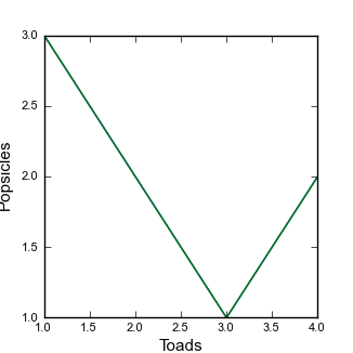 Figure 6. A not quite as simple figure
 -
There are a few things wrong with this: The label
Popsiclesis getting cut off, and the tick marks are not the same size as the borders. Lets try to fix these things.
Fixing ticks and spines
This is going to seem tedious but the way to manipulate the spines and ticks is by controlling them directly, which means adding some more lines to your code.
-
Replace the middle lines of the second plotting function with:
    ax = plt.subplot(111)
    ax.plot(x,y,linewidth=2)
    plt.xlabel(xlabel_text,fontsize = label_size)
    plt.ylabel(ylabel_text,fontsize = label_size)

    # This makes all the spines thick so you can see them
    ax.spines['top'].set_linewidth(1.5)
    ax.spines['left'].set_linewidth(1.5)
    ax.spines['right'].set_linewidth(1.5)
    ax.spines['bottom'].set_linewidth(1.5)

    # This gets all the ticks, and pads them away from the axis so that the corners don't overlap
    ax.tick_params(axis='both', width=1.5, pad = 2)
    for tick in ax.xaxis.get_major_ticks():
        tick.set_pad(10)

    plt.savefig("Figure2.pdf", format = FileFormat)
    plt.clf()
This solves some of the problems:
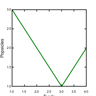 Figure 7. A not quite as simple figure, with adjusted ticks and spines
 -
What is going on here? First I use
subplotto get an axis handle so that I can control the elements of the axis. I then set the linewidth of the spines and ticks. I also set padding of the ticks to control how much space is between my ticks and my text. I also changes the linewidth of my plot so that it is a bit bigger than the ticks and the spines. -
If you want longer tick marks you can change the following line:
ax.tick_params(axis='both', width=1.5, pad = 2, length = 10)This will make your plot look stupid but you can see what is happening.
You can also change the ticks from pointing in to pointing out by adding this to the line:
ax.tick_params(axis='both', width=1.5, pad = 2, length = 10, direction="out")
Getting things to fit
In previous lessons, we have used the tight control on figure formatting. However, sometimes when you mix multiple elements this doesn’t work. In addition, you might want some control over placement of your figure’s elements. This is where the GridSpec package is very useful.
GridSpec allows you to make totally custom plots, and helps place different plot elements. I encourage you to read the documentation on the matplotlib website if you want to make custom grids, but here I just go over some of the basics.
-
First, add a third module to your plotting code:
The GridSpec version of your figure# A very simple plot that makes an 83mm wide figure, using GridSpec def SimpleGridSpecPlot(x,y,xlabel_text = "x", ylabel_text = "y"): # We need to get the GridSpec package from matplotlib.gridspec import GridSpec # We want a pdf figure so we set the fileformat to pdf FileFormat = "pdf" # Set the label font default_size = 8 label_size = 11 # Set up fonts for plots rcParams['font.family'] = 'sans-serif' rcParams['font.sans-serif'] = ['arial'] rcParams['font.size'] = default_size Fig1 = plt.figure(1, facecolor='white',figsize=(3.26,3.26)) # generate a 100x100 grid. The other bits of data are the padding on the edge gs = GridSpec(100,100,bottom=0.13,left=0.0,right=0.95,top=1.0) # Now place the plot in the grid. NOTE: the first set of numbers is the rows (vertical direction), # starting from the TOP ax = Fig1.add_subplot(gs[15:90,15:95]) ax.plot(x,y,linewidth=2) plt.xlabel(xlabel_text,fontsize = label_size) plt.ylabel(ylabel_text,fontsize = label_size) # This makes all the spines thick so you can see them ax.spines['top'].set_linewidth(1.5) ax.spines['left'].set_linewidth(1.5) ax.spines['right'].set_linewidth(1.5) ax.spines['bottom'].set_linewidth(1.5) # This gets all the ticks, and pads them away from the axis so that the corners don't overlap ax.tick_params(axis='both', width=1.5, pad = 2, length = 3,direction="in") for tick in ax.xaxis.get_major_ticks(): tick.set_pad(10) plt.savefig("Figure_GridSpec.pdf", format = FileFormat) plt.clf() -
Again, to run this you need to insert a line in your
test_copernicus.pyfile.The resulting figure looks like this:
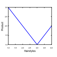 Figure 8. A figure positioned using GridSpec
 -
You can try to adjust the numbers in the following lines to see the effect:
    # generate a 100x100 grid. The other bits of data are the padding on the edge
    gs = GridSpec(100,100,bottom=0.13,left=0.0,right=0.95,top=1.0)

    # Now place the plot in the grid. NOTE: the first set of numbers is the rows (vertical direction),
    # starting from the TOP
    ax = Fig1.add_subplot(gs[15:90,15:95])
5.3.4. Where to go from here
Okay, you might be thinking that this is quite a lot of work for just a simple figure. But you can copy and paste code: I’ve not written these kinds of scripts from scratch in many years: I recycle old code. In addition, this approach allows you to exactly create a figure for a paper that can be easily reproduced, a big advantage in scientific data analysis.
We have obviously only scratched the surface of matplotlib plotting, but hopefully this has given you some ideas about where to dig deeper if you want learn about making figures using Matplotlib.
5.4. Summary
This chapter has gone through the basics of plotting data using matplotlib. From here, you can start modifying your scripts, or trying to create new plots by following the examples on the matplotlib website.
Appendix A: Software
There are quite a few different components you need to get working on your system to perform the examples in this book (sorry!). Some of these are essential, and some are optional and included for completeness. In the following appendices, instructions for getting them installed on Windows, Linux, and MacOS are included.
| Most of the software described here has reasonably simple installation packages for all operating systems. However, the videos are often presented in the context of a Linux shell. If you do not have access to a Linux server, your best bet is to follow our instructions for Creating a Linux environment inside any computer. |
A.1. Essentials
The following tools are core to the contents of this book, and will need to be installed before you can work on the exercises in the book.
A.1.1. A text editor
A text editor is just a program to edit text. This should not be confused with a word processor, which adds a bunch of formatting and often saves files in binary format (meaning if you open them with a text editor and not a word processor all you will see is gibberish).
Good text editors do things like highlight code syntax and allow you to easily navigate large numbers of files.
A number of good options exist, all of which you can download for free:
-
Brackets is an open source text editor that has many nice features and works on all major operating systems. This book and all the code examples in the course were written in this very nice text editor.
-
Atom is made by the people who made Github. It is also nice but I had trouble installing some extensions on a Windows machine.
-
Textpad is a lightweight text editor that has fewer features than the other options but runs very quickly. Only works on Windows.
-
PSpad is lightweight like Textpad, but has some nice code navigation features (the author of this book uses it to edit C++ code because of these features). Only works on Windows.
If you want a consistent environment across operating systems we recommend Brackets.
A.1.2. Git
A.1.3. Python
Python is a programming language used by many scientists to visualize data and crunch numbers. You can also use it to automate data management. We will use Python 2.7.
You will need:
-
The python programming language. We will use Python 2.7.
-
Scipy, for scientific python. It includes lots of useful packages like
-
Numpy for fast numerics.
-
Matplotlib for plotting.
-
Pandas for data analysis.
-
-
pip for python package management, although this is only needed if you like doing things by hand and don’t use miniconda.
-
In addition, if you want a nice interface Spyder is quite useful.
-
Also, if you are going to be working with geographic data, GDAL is also recommended.
-
A.1.4. R
R is a program and a programming language for statistical analysis. Compared with the other packages you will need, R is quite painless to install on your computer! Just download and install!
A.1.5. QGIS
A.1.6. Inkscape
Inkscape is an open source graphics editor, which has many of the same functionalities as Adobe Illustrator. It is very useful for preparing attractive figures for papers, reports and theses.
A.2. Useful extras
You could find these tools useful. In particular, my documentation is written using something called asciidoctor, which is implemented in a programming language called Ruby. I love asciidoctor and can’t say enough good things about it. But installation of Ruby and associated packages are not required for the course.
A.2.1. Ruby
Ruby is a programming language used frequently by web developers and has many package for building documentation and automating collection of data over the internet. In this book we will really only use it for documentation, but there is a large ecosystem of open source tools available in Ruby. It hasn’t been adopted to a great extent by the scientific community but you may still find useful tools, particularly if you are gathering online information.
You will need:
-
The Ruby programming language
-
Rubygems for updating ruby.
-
bumdler for managing updates and making sure scripts are up to date.
-
RubyDev kit which is needed for some other Ruby packages.
-
asciidoctor for making notes, documentation and books.
-
-
In addition you will need Node.js for some of the Ruby tools to work.
A.2.2. C++ and fortran
A number of scientific programs are written in these languages so information on how to get them working on your windows machine is included here for completeness.
To get these working you will need
-
The compiler. This is what translates the program into something the computer can understand.
-
The tool
make, which automates building programs. -
The tool
gdb. which stands for gnu debugger, a tool for debugging code. -
The tool
gprof, which is a profiler: it allows you to see which parts of your code are using the most computational resources.
A.3. Creating a Linux environment inside any computer
For most of the topics covered in the course you can install things on any operating system. However, for some applications Linux is either the easiest option, particularly when it comes to numerical modelling. If you use university servers or supercomputers, you will need to use Linux, and cloud computing services like Azure or Amazon Web Services are also largely based on Linux operating systems. So for scientists it is often advantageous to be able to work in a Linux environment. Most personal or desktop computers, however, run either Windows or MacOS. This section explains how to get a Linux environment working on any computer. The way you do this is with virtual machines.
A virtual machine is software that allows you to emulate an operating system within another operating system (for example, you can create a Linux operating system within a Windows computer). Believe it or not, there are many good reasons to create virtual machines that have the same operating system as the host computer (if this seems like a foreign language, see the jargon table).
| Term | What it means in English |
|---|---|
Virtual machine |
A computer that lives inside another computer, via something called virtualisation software. Basically you can have a computer that is, say Windows, and use virtualisation to create a Linux machine living as a program within your Windows machine. |
host |
The host is the computer on which the virtual machine is running. |
client |
The client is the virtual machine. It lives within the host. |
A.3.1. Why would I want to make a virtual machine?
There are a few reasons for making virtual machines.
-
For scientists, the main reason is that the key software you need doesn’t work on your operating system, but you don’t want to maintain a second computer just to run one or two particular bits of software.
-
A huge problem for businesses and an emerging problem for scientists is the "works on my machine" problem. Each user of various tools or software might have a different system setup so a toolchain might work on one person’s computer and not on another. If you are a business trying to distribute software and you rely on a client having the same computer setup as you, then you are doomed. This is also extremely important for reproducibility in science: there is no use distributing code if users can’t get it to work!! Virtual machines allow you to distribute tools and analyses with all the settings set up so things just work.
A.3.2. Software for creating and managing virtual machines
There are various ways to manage virtual machines.
-
Virtualisation software: These are programs that allow you to host a guest operating system. There are some commercial and open source alternatives. We use VirtualBox and the examples in this book are based on it.
-
VirtualBox is open source and very well maintained. It just works. You should use this.
-
VMWare used to have a free version but they keep making it more difficult to find on their website. The authors of this book used to use it but the company that makes it decided to move to a fee-based system, so we no longer use it.
-
Parallels is very popular commercial virtualisation software. It works well and seems to be popular with people using MacOS. But why not use an equally good open source version like VirtualBox?
-
-
There is software called Vagrant which is complementary to virtualisation software. It automates creation of virtual machines so you can get exactly the same environment every time. It also allows you to sync files across operating systems. It is fantastic.
-
Many businesses use something called Docker but this is mainly for distributing Linux-based stuff over the cloud. Recently a few scientists have started distributing all analysis associated with papers using a Docker image, but we’ll not discuss this further. You’ll only come across this is you are deep into software development. It does bear some superficial similarities to Vagrant but for our purposes Vagrant is more appropriate.
A.3.3. Creating a full functioning Linux operating system in your computer
You might want to create a fully functioning Linux operating system in your computer. By this I mean you will see the desktop of the Linux system when you start you virtual machine and it will have all the bells and whistles of the full operating system.
We do not recommend doing this! It is overkill for our purposes, and is a waste of space on your hard disk as well as being a drain on your CPU. We include the instructions here for completeness.
-
Download and install VirtualBox.
-
Download a disk image of a Linux operating system. Ubuntu is very reliable. Another option is Debian
-
Most computers do not allow 64 bit guest operating systems, so choose a 32 bit version. To enable 64 bit, you need to change settings in the startup of your computer, which is a bit scary and I won’t take responsibility for wrecking your computer.
-
-
Follow the instructions in VirtualBox to create a new machine using this disk image.
There are two big disadvantages to this approach. First, the guest operating system will be big (a fully installed Ubuntu system takes up 5-10Gb.) Secondly, and more problematic, is that the file systems on your virtual machine and on your host computer (i.e., your normal operating system) cannot see each other and you have to do a bit of tweaking to move files across. This is annoying and inefficient.
If you do go down this route, here are a few notes:
-
Installing the operating system within the virtual machine will take ages. You might schedule this task for your lunch hour, which is what I did.
-
Memory: Your virtual machine will take up some of your host machine’s memory (think of that as your computer’s brain). You need to balance the performance of your two machines. I try to give my virtual machine at least 4Gb, but if your computer has only 4Gn total this could be a problem.
-
Storage: If there is an option to sync files, make sure you select this (Vagrant does it automatically). If you don’t sync files getting data from your host machine to your virtual machine and back again is time consuming and tedious.
-
When Ubuntu has installed, it will look for software updates. You should install these. This will also take ages. Maybe you have a book to read?
-
You should be aware that the default keyboard layout in Ubuntu is US. Getting a different keyboard is a bit of a pain.
-
First go to system settings.
-
Then click on language support.
-
It will need to install some stuff.
-
Go to text entry.
-
In the lower left corner click on the
+button. -
Add your country’s input source.
-
A.3.4. Using Vagrant to make a Linux server in your computer
Vagrant helps manage virtual machines. It is fantastic. It has some major advantages.
-
It uses small server-only Linux systems so is very space efficient (although even a server-only operating systems is still ~0.5Gb).
-
It syncs files between your host operating system and client operating system. You can run code in Linux and then look at the data in Windows/MacOS immediately!
-
You set up virtual machines using files called vagrantfiles which automate installation and setup of your Linux system. These are very small files (a few kb) but if you send them to collaborator they can have exactly the same virtual system as you with minimal effort. No more "works on my machine" problems!!
The one major disadvantage is that, because Vagrant makes a server version of Linux, it cant create windows so the only way you can interact with it is via command line. So, for example, you can’t run Spyder in a vagrant virtual machine (or at least not easily). But this shouldn’t be too big of a problem because you can do data analysis in your vagrant server and that files will appear in you host operating system where you can use all your graphical tools to your heart’s content.
So, Vagrant is great! You do need to do a little bit of work to get it going however. If you know what you are doing, this will take about 2 minutes not including download time (which can be long, since you need to download on the order of 1Gb of stuff). However the first time you do this you’ll need to spend 15 minutes to an hour reading the instructions based on how comfortable you are with directories and the command line.
Appendix B: Setting up on Windows
Quite a few of the tasks we will be doing for this course can be done within Windows, but if you want your computer to mimic the environment of a Linux server you might consider reading the section Creating a Linux environment inside any computer.
B.1. Working with the powershell
Much of what we do will be through a powershell window. This is a text-based interface into your windows system that allows you to install software and run scripts and code. It functions like a linux terminal.
First of all, you need to get a powershell running. On my windows version, you just type powershell into the bit of Windows where you search for files or programs (it varies based on what windows system you are using). You should be able to find a way to get a powershell on your version of windows through the power of the internet.
B.1.1. Administrator powershell session
Your computer might tell you that you don’t have permissions to install things, in which case you can open an administrator session from a standard session
PS> Start-Process powershell -Verb runAs
The PS> denotes the powershell prompt.
|
B.2. Windows installation programs
Take a deep breath. I am afraid this is going to take a while.
B.2.1. A text editor
B.2.2. Git
Download and install git for windows.
There will be some options for you to select once you do this: the main one is something about line endings. I chose the "don’t change line endings" option.
Once this is installed you can right click on any folder in windows explorer and select the option git bash here. This will open a powershell window with git enabled. From there you can follow the instructions in the git chapter of this book.
B.2.3. Python
The best way to install python is miniconda. We will use Python 2.7, so use the Python 2.7 installer.
Once you have installed that, you can go into a powershell and get the other stuff you need:
  PS> conda install scipy
  PS> conda install matplotlib
  PS> conda install pandas
  PS> conda install gdal
  PS> conda install spyder
To run spider you just type spyder at the command line.
Warning: Spyder needs an older version of a package called PyQt. If spyder doesn’t start correctly, run conda install pyqt=4.10 -f
B.2.4. R
Luckily, R has an installation package for Windows. You can just download it from the R website.
B.2.5. QGIS
Here are the QGIS Windows downloads.
B.2.6. Inkscape
Here are the Inkscape Windows downloads.
B.2.7. Ruby
You can check to see if Ruby is installed on your system by typing
PS> ruby -vand you can check the Rubygems version with
PS> gem -vIf you don’t have it, just download and install from the Ruby website.
You will also need Ruby gems: download it and run:
PS> ruby setub.rbfrom the folder to which you downloaded the files.
B.2.8. Fix rubygems on Windows
At the time of this writing, rubygems is "broken" on Windows: if you try to install a gem file you will get an error that says you cannot make an SSL connection. You will need to fix this problem by copying a trust certificate into you rubygems folder.
-
First download the file AddTrustExternalCARoot-2048.pem.
| It seems some browsers add formatting to this file when downloaded (Chrome does this, for example). I only managed to get this fix to work after downloading the file using Internet Explorer. |
-
Next, find the location of your gems installation:
  PS> gem which rubygems
C:/Ruby21/lib/ruby/2.1.0/rubygems.rb-
Go to the folder and then go into the SLL_certs subfolder. In this case it is at:
C:/Ruby21/lib/ruby/2.1.0/rubygems/SSL_certs. Copy the.pemfile into this folder. Rubygems should now work.
B.2.9. Install some gems
From here we can install some useful ruby gems. Asciidoctor is really great for writing documentation. Bundler is useful for keeping Ruby packages up to date.
  PS> gem install asciidoctor
  PS> gem install bundler
B.3. C++ and Fortran
From long and painful experience, don’t try to do C++ and Fortran on Windows if you are doing scientific computing. Instead use Vagrant to build a Linux server on your computer following these instructions: Using Vagrant to make a Linux server in your computer.
If you have been trying to develop scientific software with these languages on a Windows machine an are hearing about Vagrant for the first time, once you finish setting and realise how amazing it is you can send flowers, chocolates, prosecco, etc. to:
Simon Mudd
University of Edinburgh
School of GeoSciences
Drummond Street
Edinburgh EH8 9XP, UK
You are very welcome.
B.4. Turning your windows machine into a Linux machine
You can follow instructions in the section Creating a Linux environment inside any computer.
B.5. Summary
By now you should be able to pull up a powershell and call the essential programs we will be working with in this course.
Appendix C: Setting up on Linux
Setting up your system on Linux is considerably easier than setting up on Windows.
Before doing anything, open a terminal window. The $ symbol below indicates commands typed into the terminal window.
| These commands are for Ubuntu and Debian flavors of Linux. Other flavors of Linux use different package managers, such as yum. If you don’t use Debian of Ubuntu, you will need to look up the installation guidelines for the programs below. |
C.1. A text editor
We recommend Brackets:
$ sudo apt-get install bracketsNote that this will only work with a windowing system (i.e., not on a server-only version of Linux).
C.2. Git
To check if git is working, type
$ git --versionIf it isn’t installed, install it with
$ sudo apt-get install gitC.3. Python
To check if it is working, just type
$ pythonIf it is working, it will tell you the version and you will get a command prompt that looks like this:
>>>You should have version 2.7 or above.
C.3.1. Installing python using miniconda
Native Linux users will probably want to do things using pip (see below) but you can also use miniconda. First install miniconda using instructions here. We will use Python 2.7, so use the Python 2.7 installer. Then use the conda command to install stuff:
  $ conda install scipy
  $ conda install matplotlib
  $ conda install pandas
  $ conda install gdal
  $ conda install spyder
To run spider you just type spyder at the command line.
Warning: Spyder needs an older version of a package called PyQt. If spyder doesn’t start correctly, run conda install pyqt=4.10 -f
Note that spyder will only work if you have a windowing system (i.e., you can’t use it via a ssh connection).
C.3.2. Installing python using pip
If you don’t have python, you should install both python and pip, which manages python packages. To do that type:
  $ sudo apt-get install python2.7
  $ sudo apt-get install python-pip
C.3.3. Installing python packages using pip
To check if python packages are there, just try to import them. First start a python session:
$ pythonThen, try to import a package. For example:
>>> import matplotlibIf the package does not exist, you will get an error message like this:
  Traceback (most recent call last):
    File "<stdin>", line 1, in <module>
  ImportError: No module named matplotlib
You can install all the packages at once with:
$ sudo apt-get install python-numpy python-scipy python-matplotlib ipython ipython-notebook python-pandas python-sympy python-noseYou can upgrade packages with the pip command:
$ pip install PackageNameHere --upgradeC.4. R
You can check if R is working from the terminal window with:
$ RIf it isn’t there, you can install it with
$ sudo apt-get install RC.5. QGIS
Linux installers are on the QGIS downloads page. You will need a windowing system for this.
C.6. Inkscape
You can install with
 $ sudo add-apt-repository ppa:inkscape.dev/stable
 $ sudo apt-get update
 $ sudo apt-get install inkscape
You will need a windowing system for this.
C.7. Optional: Ruby
You can see if Ruby is ony your system by typing:
$ ruby -vIf it isn’t there, install with (this should seem routine by now):
$ sudo apt-get install ruby-fullC.8. Optional: c++ and fortran
You can check if these are working by typing (this assumes you are using the GNU compilers)
  $ g++
  $ gfortran
You can install these with
  $ sudo apt-get install g++
  $ sudo apt-get install gfortran
These seem to install gdb and make, which is convenient.
C.9. Summary
Well, you have probably spent some time installing all of these software packages so relax for a bit and enjoy the beverage of your choice!
Appendix D: Setting up on MacOS
MacOS is built on top of a Linux operating system, so installing things can be a bit smoother on MacOS than on windows.
D.1. Working with the terminal
Under the hood of MacOS is a Linux operating system. You can access it by opening the terminal. You can open a terminal window using Finder. Once you open a terminal window you will see the $ symbol which indicates a command line waiting for commands, just like in Linux.
D.2. MacOS installation programs
Many of the tools we will be using have nice, simple installation packages. However installing everything will take time.
D.2.1. A text editor
D.2.2. Git
On many MacOS systems, if you open a terminal window and type git, MacOS will install it for you if it doesn’t already. Alternatively, you can download a MacOS installer.
D.2.3. Python
The latest MacOS systems come with python. Managing all the extra packages in MacOs is probably easiest with miniconda. We will use Python 2.7, so use the Python 2.7 installer.
Once you have installed miniconda, you can go into a terminal and get the other stuff you need:
  $ conda install scipy
  $ conda install matplotlib
  $ conda install pandas
  $ conda install gdal
  $ conda install spyder
To run spider you just type spyder at the command line.
Warning: Spyder needs an older version of a package called PyQt. If spyder doesn’t start correctly, run conda install pyqt=4.10 -f
D.2.4. R
Luckily, R has an installation package for MacOS. You can just download it from the R website.
D.2.5. QGIS
The QGIS MacOS installers are located here.
D.2.6. Inkscape
The Inkscape MacOS installers can be found here. To get inkscape to work you will need something called Xquartz.
D.2.7. Optional: Ruby
You can check to see if Ruby is installed on your system within the terminal window
$ ruby -vand you can check the Rubygems version with
$ gem -vIf you don’t have it, just download and install from the Ruby website.
You will also need Ruby gems: download it and run:
$ ruby setub.rbfrom the folder to which you downloaded the files.
From here we can install some useful ruby gems. Asciidoctor is really great for writing documentation. Bundler is useful for keeping Ruby packages up to date.
  $ gem install asciidoctor
  $ gem install bundler
D.2.8. Optional: C++ and Fortran
Let’s be honest, if you are using C++ and Fortran you don’t need me to tell you how to install stuff. But here is a instruction website for completeness.
D.3. Turning your MacOS machine into a Linux machine
Well, your MacOS is built on Linux so it actually is already a Linux machine. However, if you want to have a full blown Linux operating system, you read the section on Creating a Linux environment inside any computer.
D.4. Summary
By now you should be able to pull up a terminal window and call the essential programs we will be working with in this course.